SideSlide revolves around a customizable workspace that can be
conveniently positioned in various screen corners, including the top, bottom, right, and left sides:
You can relocate the workspace by dragging it using its title bar. As it nears the screen's edge, it will automatically tuck away.
SideSlide seamlessly accommodates multi-monitor configurations, ensuring usability from any location.
Adjust the workspace size by positioning the mouse pointer over the window borders.
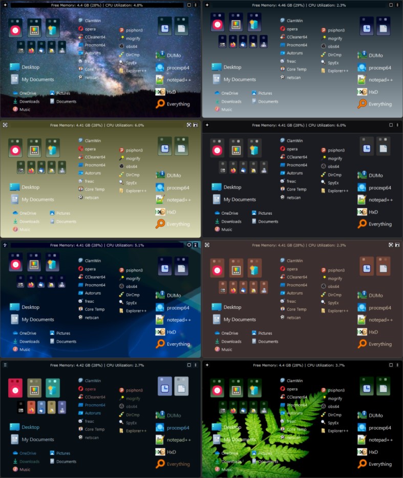
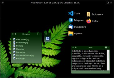
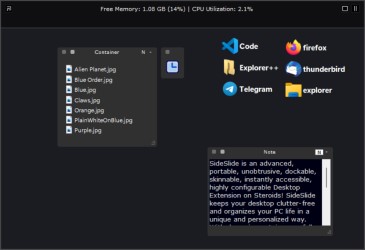
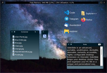
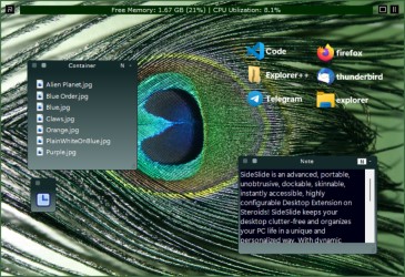
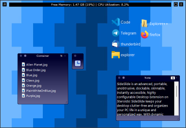
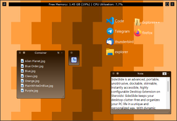
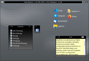
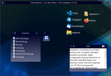
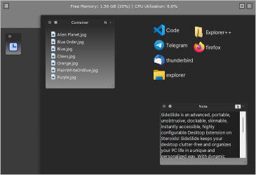
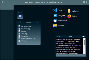
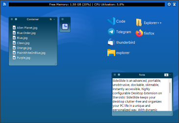
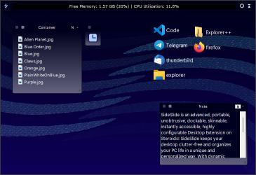
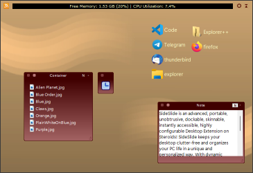
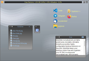
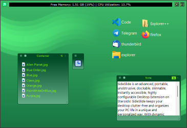
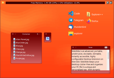
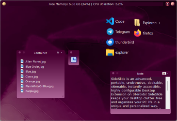
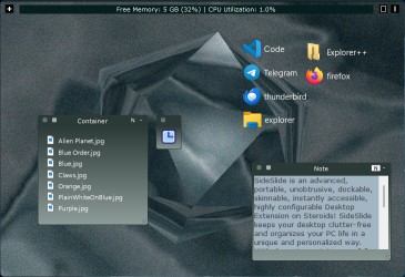
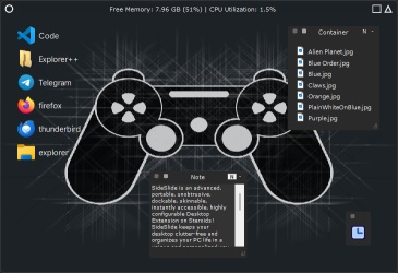
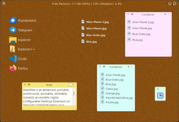
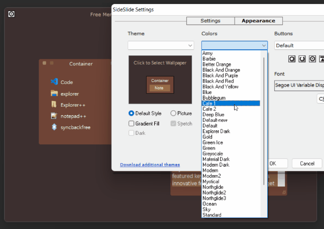
Use the Appearance dialog [F4] to fine-tune nearly every element of the program's aesthetics, allowing you to match it with your personal preferences. This includes theme selection,
color alterations, button customization, font changes, as well as background image or gradient fill adjustments.
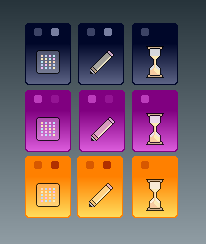
For illustration, here's the same workspace presented in different styles:
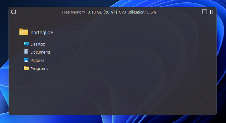
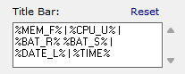
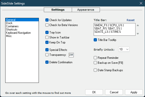
The title bar can be configured to display various types of information. Any text typed into the Title Bar field will be shown, in addition to the following macros:
%CPU_U% - CPU Utilization
%MEM_F% - Free Memory
%BAT_R% - Battery Remaining (percent)
%BAT_S% - Battery Status (Plugged in/Discharging)
%DATE_L% - Long Date
%DATE_S% - Short Date
%TIME% - Time (12 or 24-hour format)
%VER% - Program's version
This section will be expanded with future updates.
To configure the Title Bar open the Settings dialog and go to General → Title Bar:
Creating a unique title with or without macros is a good idea when running multiple program instances, helping to distinguish each workspace effortlessly (see the Extras section for more).
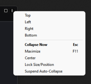
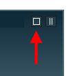
To swiftly position the workspace at the chosen corner, simply right-click on the "Collapse Now" button located in the upper-right corner:
Select Maximize to maximize the workspace.
Alternatively, you can achieve this by double-clicking the title bar.
Enabling a maximized workspace offers an alternative approach to utilizing SideSlide,
achieved by deactivating the 'on top' window property.
This can be configured through the settings menu: [Settings → General → Keep On Top].
Toggle the display of the maximized workspace by using either the Windows notification area icon or the Global Hotkey.
Tip: Utilizing a maximized workspace offers an effective technique for organizing shortcuts.
Adjust the object placements as needed, and subsequently revert the workspace to its standard operational mode.
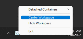
Center, which is also available from the notification area icon, will center the workspace on the desktop.
Lock Size/Position: Choose this option to prevent unintentional adjustments to the workspace's position and size.
This option is especially useful when undocking the workspace with touch while
working in tablet mode. The workspace will automatically unlock when altering the screen resolution or
when the screen switches between horizontal and vertical orientations.
Suspend Auto-Collapse: Select this option when adding a bunch of shortcuts to the workspace
(by dragging from the Desktop or an Explorer window) to prevent the workspace from tucking away/collapsing.
Keyboard navigation: Use [Alt]+[Space] to show this menu, [F11] to maximize/restore the workspace and
Esc to tuck it away.
The screenshot below depicts the workspace in its typical "working mode," revealing only a slim segment of SideSlide's docking bar:
Select between Large, Normal and Small size for the dock [Settings → Dock → Size].
When Normal or Small are selected, use Relative Position (Settings → Dock → Relative Position) to choose the
position of the docking bar in relation to the workspace.
Other options within [Settings → Dock] can used to change the bar's color, make it completely invisible (when 'Large' is selected), set it to
quickly flash for a couple of times when it tucks away and more.
The workspace springs into action as soon as the mouse is moved to the edge of the screen
it is tucked in and is kept in the same position for half a second.
Click to undock the workspace immediately without waiting.
Use the Global Hotkey ([Win]+[Alt]+[S] by default) to invoke the workspace using the keyboard.
From Settings dialog, disable the delay before the workspace pops out [Settings → Dock
→ Undock Immediately] or select to ignore mouse movement when it hovers over the
workspace and only show it on click [Settings → Dock → Undock on Click].
Select Center Mouse [Settings → Dock → Center Mouse]
to move the mouse cursor to the center of the workspace when it's undocked with the mouse.
When the workspace is in focus it's possible to use the various keyboard commands and features,
The workspace will grab the focus on mouse click, when using the Global Hotkey or simply by hovering with the mouse
over the workspace when the Grab Focus option is selected [Settings → Dock → Grab Focus].
By default, the workspace will be on top of other windows and above the Windows Taskbar, in case
it's positioned at the same location. Disable this option from the Settings dialog and
completely hide it from the system-tray menu [Settings → General → Keep On Top].
Right-click an empty space inside the workspace to reveal the context menu
from which almost every aspect of the program can be controlled. The menu can also be accessed by
clicking the top leftmost button.
When accessing the workspace menu from the title-bar button, it also includes items related to the RSS news feeds functionality.
Use the Settings & Appearance dialog change most of the default behavior and completely change the way SideSlide looks.
Press [F3] to open the Settings dialog, [F4] to show the Appearance section and [Ctrl+Tab] to switch between them.
Choose the desired section from the list on the left and go over the options with the mouse to see short info tooltips that explain
what each option does.
[Settings → Keyboard Navigation → Global Hotkey]: Enter [ _ ] (underscore) instead of a
letter to use the spacebar key, or \ (down) / (up) < (left) > (right) for the arrow keys.
Otherwise use A-Z or 0-9. For example, set [Alt]+[Ctrl]+[1] to show and hide the workspace using the keyboard.
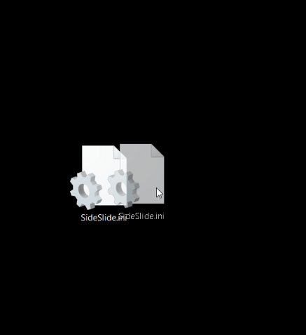
All of SideSlide settings are stored in a single folder (press [F3] - "Open Settings Folder" when the Settings dialog is active).
For backups, it's only required to copy SideSlide.ini and the files under the Containers folder to a safe location.
Another way is to use the Backup option from the workspace right-click menu (Extra → Backup), the
"/backup" command line argument or select the [Settings → General → Backup on Save] option.
To restore from backup: Open the settings folder and exit SideSlide.
Extract the *.con files from "SideSlide_Backup.zip" into the Containers sub-folder and SideSlide.ini into the main settings folder.
Make sure to delete any previous *.con files from the Containers sub-folder before extracting the backed-up copies.
Changes made while the program is running are saved to temporary files until it's properly closed.
If there is a system or program crash, the most recent changes will be automatically restored.
Select [Settings → Misc. → Ignore Changes] to restart the program and restore the last saved
session, ignoring all changes made to the workspace since the last time it was saved.
Manually save the workspace [F8] to permanently write the latest changes to disk.
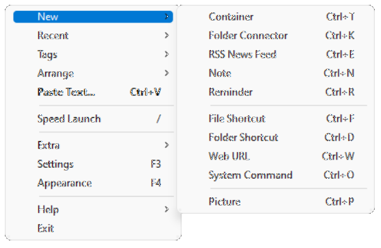
Add different kinds of objects to the workspace by right-clicking
an empty place inside the workspace to show the popup menu.
Select New and the object you'd like to add from the menu:
Use the hotkeys shown in the menu to create objects
with the keyboard. The new object will be positioned where mouse
pointer is.
There are other ways of adding objects to the workspace, such as,
using the Online Library, dragging and dropping from Windows
Explorer (e.g. your desktop) or the web browser, copying and pasting
and more. More info can be found below.
Once adding objects to the workspace is complete, there is an option to lock the workspace for editing to prevent accidental object movement:
When the workspace is locked for editing, the Lock button will
be briefly shown above objects you are trying to move, allowing
you to unlock it for 10, 15 or 20 seconds [Settings → General → Briefly Unlock] before
locking up again. The workspace won't lock back as long as objects are being moved.
Right-click the Lock/Unlock button to show the menu:
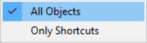
Choose between locking the movement (including resizing) of all objects (containers, pictures,
notes, etc) or select to lock only the shortcuts in place.
The workspace is expandable beyond its limits by the use of
containers. New containers' size is initialized to a default value that can be manually adjusted by holding down the left mouse button
and dragging it from the bottom-right corner, or by right or middle-clicking the bottom right corner to auto-size it:
- The container will be resized if there is space for it to expand to, and then revert back to the original size.
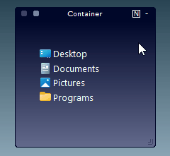
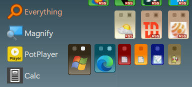
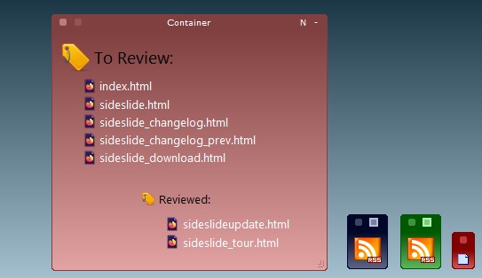
Containers offer a versatile solution for organizing an array of elements.
These encompass file and directory shortcuts, RSS news feeds, notes, URLs, images, and even the option to integrate folder
connectors linking to physical folders on the disk (please note that this experimental feature is not covered in this tour).
The beauty of containers lies in their ability to be detached from the workspace, shrunk and folded to occupy
minimal space, repositioned (with Ctrl+Z for undoing a move and Ctrl+Y for redoing), resized, renamed, rearranged,
and even customized with varying colors, among other options. Add multiple shortcuts to the same container and group
a bunch of them together using tags, or simply start multiple shortcuts at once.
- Using a container to manage a project
Tip: Change the name of a single container to #STARTUP (the number sign followed by the
word STARTUP in all caps) and all of the shortcuts inside will be launched when SideSlide starts.
This feature is useful to quickly add/remove startup programs when SideSlide is set to start with Windows.
The following clip illustrates the fundamental operations that can be performed with containers within the workspace:
- Container basics
Select Tag/Refresh RSS: This button is used to refresh selected
RSS news feeds when the container is a news feed container, or to
list container shortcuts that belong to the same tag (more on that below).
Besides the Fold/Unfold button, it's also possible to fold and unfold
containers by double-clicking (or middle mouse click) the container name label. Once you
double or middle-click to unfold a container, expand a shrunken container or click the workspace,
the previously unfolded container will fold back, keeping the workspace clutter-free.
Move the mouse over the Shrink/Expand button to expand shrunken
containers. Click the container icon to expand it, double-click an empty space to shrink it back.
Start all shortcuts within a container by double-clicking the container
icon when shrunk by enabling [Settings → Containers → Double-Click to Start All], or from
the Container's Right-Click Menu → Shortcuts → Start all. When this option is unselected,
double-clicking a container icon will immediately expand it, overriding the animation.
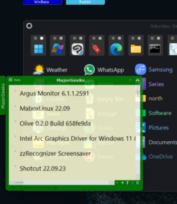
Add ready-made containers from the Container Library
which is accessible by pressing [F6] or
from the workspace right-click menu (under the Extra submenu):
Click the Go button when the search field is empty to list
all containers in the library sorted by date.
Submit containers to the library by right-clicking a
container and selecting Submit to Library. At this time, you
can only submit RSS containers.
To add shortcuts to shrunken or folded containers, drag them to
the container and hover for half a second over the container in
its folded or shrunken state so that it will expand and allow you
to place the shortcuts inside.
When the container is folded at the bottom of the workspace, it
will unfold from 'bottom to top':
When the 'Container from Folder' setting is enabled, dragging a folder from the Windows Explorer
to the workspace will create a container with shortcuts to the files within.
Shrink expanded containers by double-clicking an empty
place inside. In addition, shrink expanded RSS news feeds containers by right-clicking
between the headlines.
When set to auto-expand (default), a container will shrink when
you move the mouse away or click an item inside. Keep the
container expanded using the container right-click menu command
'Keep Expanded', or click an empty place inside to keep it open
until you click on anything else outside of the container.
The icon for a shrunken container will be based on the first
shortcut you add to it, but it's possible to select a different one
via the container right-click menu, or by right-clicking a
shortcut inside the container and selecting the 'Use icon'
command.
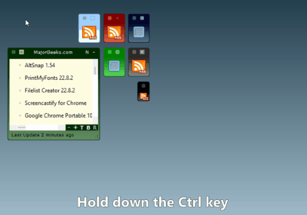
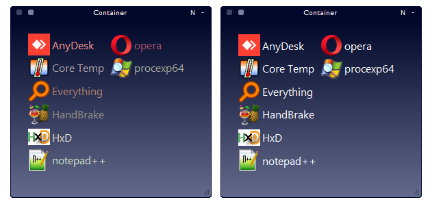
Select multiple containers with the mouse or by holding down the
[Ctrl] key and clicking the container name label when it's fully
visible of folded, or icon, when shrunk.
When dragging a single container while holding down the [Ctrl] key, all other selected
containers will be repositioned as well:
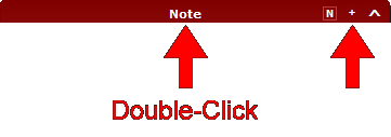
When the container note contains text but is hidden, it will be indicated
in the container toolbar with a square over the [N] button in the upper-right corner:
Use the mouse wheel to resize the text in notes and headlines
font in RSS news feed containers by holding down the [Ctrl] key.
It's also possible to use the Pinch Zoom gesture in supporting touchpads.
Quickly Encrypt/Decrypt notes using RC4 encryption by selecting the appropriate command from the note's right-click menu.
When the note is encrypted, an "Encrypted" label will be shown at the bottom left side of the note. The note will also become disabled so that it can't be edited until it's decrypted.
Select Settings → Dock → Auto Re-encrypt to re-encrypt decrypted notes as soon as the workspace loses the focus or
when decrypting another note. This setting is useful in case you enter the wrong password or in case you want to add text to
a note and then quickly re-encrypt it without having to re-enter the password.
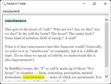
Search inside workspace notes and reminders using Extra → Search Notes or Ctrl+Shift+S:
- Both note title and content are searched
When the mouse is over a shrunken container icon or a folded container title, a tooltip will be
displayed showing information about the items inside (shortcuts, headlines, notes, etc). The tooltip also
contains the basic container mouse handling tips. Once you are familiar with them, it's possible to hide this
information by switching from "Full" to "Info" (drop-down list) under the Container section in the Settings dialog, adjacent to the Tooltip check-box.
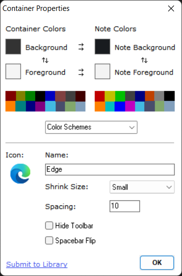
Right-click a container and select 'Properties' to open the the 'Container Properties' dialog [F2]. This dialog allows you to change various settings related to selected containers:
Colors and other settings will be applied to all selected containers.
Select custom colors by clicking the color selector boxes or one of the 16 default quick colors.
Color schemes that can be edited and saved using the Appearance dialog are also available under the Container Properties dialog.
Color Schemes → Reset to Default: Reset to the default container colors defined for the workspace.
The default colors can be configured from the Appearance dialog [F4].
Color Schemes → Colors from Icon: Use the average color of the container's icon for the background colors.
Adjust the color by clicking the Select Color box. When multiple containers are selected, different matching colors will be selected
for each container and the Container Properties dialog will be closed.
Some of the options available for selecting custom container colors:
Click the displayed icon to select a different one. The icon is shown when the container is shrunk.
Shrink Size: Choose between 3 different sizes (Normal, Small and
Tiny) to display the container when shrunk:
Spacing: Set the spacing, in pixels, between shortcuts when arranging them in the container in columns.
Set the default value for shortcuts in the workspace and for new containers from
workspace's Right-click menu → Arrange → Spacing or dynamically change the
spacing between shortcuts using the Shortcut Mini-Toolbar buttons. See below for more.
Spacebar Flip: Select the container to be included when using
the spacebar key to scroll through containers (Expand and unfold).
To use this option, from the Settings Dialog, change to 'Selected'
under Spacebar Flip [Settings → Keyboard Navigation → Spacebar Flip].
More space between the shortcuts is especially useful for a touch screen enabled device.
Hide Toolbar: Hide the two right most container buttons, Fold/Unfold and Show/Hide Note, for a cleaner look.
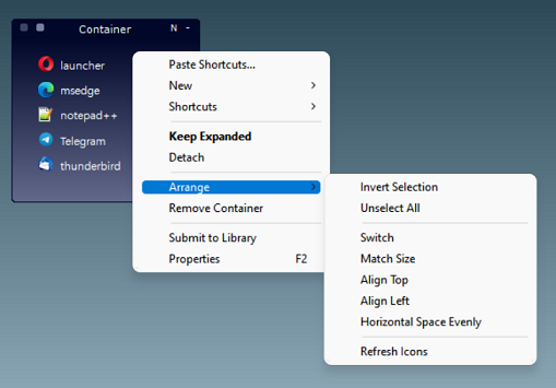
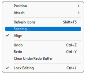
The 'Arrange' menu item lets you change and organize containers in several ways:
Switch: Switch the position of two containers in the workspace.
Select containers with the mouse or click the container's name
label (or icon) while holding the [Ctrl] key.
Match Size: Quickly match the expanded size of all selected
containers with the active one.
Align Top/Align Left: Adjust multiple containers position in bulk.
Horizontal Space Evenly: Particularly useful to space shrunken containers evenly across the workspace:
- Select multiple time to reduce or increase the space between the containers
Use the Select Tag button to hide certain shortcuts and show
others that share specific tags:
The animation below shows how to use the Select Tag button to place many shortcuts in the same container:
Some tips for creating notes:
Drag text from your web browser, or Word (or any other notepad
replacement app that supports this behavior) to create a new note
container. Hold down the [Shift] key to create a reminder:
Copy text to the clipboard and use the right-click menu command
Paste Text [Ctrl+V] to create a new note container with the copied
text.
Drag a text file (.txt) while holding down the [Shift] key to
create a note with the file's content.
Enter the letter 'n' followed by a space and the text you'd like to insert into the note.
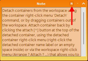
Detach containers from the workspace using the container
right-click menu 'Detach' command, or by dragging containers out of the workspace.
Attach container back by clicking the attach [^] button at the top
of the detached container, using the detached container right-click
menu (right-click the detached container name label or an empty
space inside) or via the workspace right-click menu (Arrange
→ Attach → ...) that allows you to attach all or
individual containers back.
Containers will attach and detach to the last used location, unless
you drag a container out of the workspace (in this case, it will
detach next to the workspace on the side it was dragged from) or if
you attach a container back to the workspace while the workspace is
visible and the container hovers directly above it (in this case, it
will attach to the exact place in the workspace it's above).
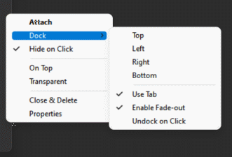
Once the container is detached, dock it to any side of the
screen (top, bottom, left and right), completely hide it (a thin
border line is always visible) or show its name in a tab so that you
can easily find it. There are more settings that can be controlled for each
detached container individually by accessing the detached container
right-click menu.
Here's a sample of a few detached RSS news feed containers:
Collapse a detached shortcuts container by double-clicking an
empty space inside the container, and RSS containers by a
right-clicking between the headlines.
Right-click a shortcut in a detached shortcut container for
options.
Keyboard navigation: [Alt+F4] to close and delete the container,
[Alt+A] to attach it back to the workspace, [Alt+Left],
[Alt+Right], [Alt+Up] and [Alt+Down] arrow keys to dock the
container.
Right-click SideSlide's system-tray icon to see a list of all
detached containers. Undock or bring forward a detached container
by selecting it from the list.
Right-click the detached container name label or an empty place
inside, in case it's a detached shortcut container, to show the
menu:
Switch between showing a small tab for the detached container or simply showing its edge by
toggling: Dock → Use Tab.
Quickly create additional detached notes with the same
colors and settings as the one that's in focus, by clicking the
[N] button in the note container toolbar or [Ctrl+N]:
Tip: Keep a single or multiple notes docked, either with a tab showing or not (Note's
right-click menu → Dock), and use it to write quick reminders:
Fold/Unfold detached containers by clicking the +/- button in the container's toolbar, or by double-clicking the detached container's title-bar:
The most common objects you will add to the workspace are
shortcuts. Shortcuts can use any custom size, emphasis and colors,
so that you can quickly find what you're looking for. Shortcuts can
be grouped and identified by tags allowing you to focus on the task
you are working on, and even start multiple related shortcuts at
once just by starting a single one. Shortcuts can point to
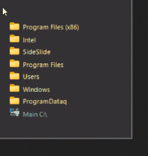
files, folders, web URLs or system commands.
Adding Shortcuts
Manually add shortcuts using the New right-click menu (Right-Click the workspace → New...) or by dragging and dropping files from the
Windows Explorer/your web browser to the workspace or to
different containers (drag the file to the corner of the screen the
workspace is located at and it will pop out). It's also possible to copy
files from the Windows Explorer and paste them in the workspace or
inside a container [Ctrl+V]. Use [Ctrl+Shift+V] or the menu option 'Paste to Container'
to paste shortcuts inside a new container. SideSlide is sharing the global clipboard with Windows so it's also possible to copy files from within SideSlide and paste them to a different location, such as the Desktop folder.
Tip: Add a new website shortcut by dragging the URL from your web
browser's address field.
Arranging shortcuts with the mouse
- Basic Drag and Drop
Holding the [Alt] key while dragging shortcuts will display the shortcut's x/y coordinates in the title bar.
Select multiple shortcuts with the mouse in the same way you select
icons on the desktop. Then, click and drag a single shortcut by its name label (as opposed to the shortcut's icon) to sort all the rest accordingly:
See below under Keyboard Navigation for ways to arrange shortcuts with the
keyboard.
Shortcut Mini-Toolbar
Select newly added shortcuts with the mouse to show the shortcut
mini-toolbar. Use the toolbar buttons to quickly apply style
settings or manipulate selected shortcuts: Start all selected
shortcuts, zoom-in, zoom-out, increase and decrease spacing, manually set the size, toggle bold
font, sort ascending (A to Z), sort descending (Z to A), select
color and remove selected shortcuts:
Another way to show the mini-toolbar is by clicking a shortcut
while the [Ctrl] key is pressed.
Hold down the [Ctrl] key and scroll up or down with the mouse
wheel (or use the Pinch Zoom gesture) to zoom in and out of
shortcuts.
Clicking the color box in the shortcut mini-toolbar allows you
to open the Shortcut Properties dialog, select a custom color for the shortcuts or select colors
based on the shortcut icons:
More on shortcuts:
The number of selected shortcuts is shown in SideSlide's title bar. When a single shortcut is
selected
and it's inside a container, the container's name is shown inside square brackets alongside the
shortcut's name. This can be helpful when using the Keyboard
Launcher to start shortcuts and you'd
like to know in which container the shortcut is hiding in.
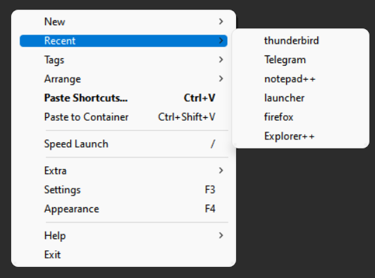
Access recently activated shortcuts via the right-click menu → Recent.
It's an easy way to quickly restart your mostly used, previously closed programs.
Move multiple selected shortcuts together and keep them in the
same order by holding down the [Ctrl] key while moving (otherwise,
the shortcuts will be automatically arranged).
Use the [Ctrl] key to right align shortcuts by dragging them a little bit beyond
the right edge of the workspace and then releasing the [Ctrl] key:
This also works for shortcuts inside a container.
Swap the location of two shortcuts by dragging a shortcut by its
icon and dropping it on top of another icon. This will work from
anywhere, so it's possible to switch shortcuts in different containers or in
the workspace:
To make sure you are in the right place, a tooltip is shown
when you hover over the shortcut icon with the one that is being
dragged indicating that the shortcuts are about to switch
places.
Drag files from the Windows Explorer to Folder Shortcuts to easily copy and move files from any location, to anywhere.
Hold down the Ctrl key to toggle between Copy and Move:
Conflicts are dealt with in the same way Windows 7 handled file name conflicts: If files in the destination share the same name with
files in the source, an option is displayed allowing you to keep both files, renaming the files being copied.
Tip: Add a shortcut to the desktop folder and use it to quickly move/copy files to the desktop from anywhere,
without the need to hide all open windows.
Drag a shortcut icon (also select multiple shortcuts and drag a single one)
and drop it on top of another shortcut label to activate the latter using the first shortcut as
the command line argument:
Another option for opening shortcuts with different ones is by using the
Send To
command from the shortcut right-click menu.
Drag a file (or multiple files) from the Desktop or any other Windows
location to programs that are in the workspace or in different containers to open it with
that program:
Disable the "Open With..." confirmation from the Settings dialog under the Shortcuts section.
When you drag and drop Windows shortcuts from the desktop folder,
by default, they will be sent to the recycle bin. There is also an option to
create Windows shortcuts out of SideSlide shortcuts and commands using the right-click menu.
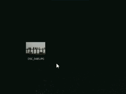
Preview picture file shortcuts when the mouse pointer hovers over
an unselected shortcut. Hold down the [Ctrl] key to override this
behavior and close the preview by moving the mouse away or by
clicking it:
Select the Pin to Workspace button [^] to add the picture
itself to the workspace.
Disable picture previews from the Settings dialog.
Add actual pictures to the workspace or to different
containers and later convert them to shortcuts to the picture files. See below for
more.
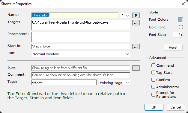
The Shortcut Properties dialog allows you to
change advanced settings for
each selected shortcut. Open the dialog via the shortcut's right-click menu, or by pressing
[F2]:
Hover with the mouse pointer over the items in this dialog to
see more information about each option.
Prompt for Parameters: Select this option to always prompt for parameters when launching the
selected shortcut(s). Already selected parameters (in the Parameters field) will be displayed
and you can
also ignore the parameters altogether. This option is particularly useful for frequently used
programs that require different parameters every time they are launched.
Tip: Use Windows Environment variables such as %tmp%, %onedrive%, etc as parameters for shortcuts
(these can be defined within Windows' System Properties, Environment Variables).
Command: Select this option to add a system command rather than a file shortcut.
Tip: Use && to separate multiple commands.
Example 1: To disable hibernation, put the computer to sleep
and re-enable hibernation; paste the following in the command
text field then check the Administrator check-box: powercfg
-hibernate off && rundll32.exe
powrprof.dll,SetSuspendState 0,1,0 && powercfg -hibernate on
Example 2: Exit Skype and Telegram and then restart explorer in order to refresh the
lingering notification area icons; paste the following in the command text field:
taskkill /f /im Skype.exe && taskkill /f /im Telegram.exe && taskkill /f /im
						explorer.exe & %systemroot%\sysnative\cmd.exe /c start /B explorer.exe
Icon: Use an icon from a different file instead of the program's own icon.
When using a custom icon for System Command shortcuts, a command icon indicator will be overlaid on top of the custom icon:
This can be disabled from [Settings → Shortcuts → Command Icon Overlay].
Enter @ instead of the drive letter to use a relative path in the Target, Start-in and Icon fields.
Example: @:\sample\shortcut.txt: Launch shortcut.txt from the 'sample' folder which is on the same drive SideSlide is running from.
Comment: Show a tooltip when hovering over the shortcut's icon. This is especially useful if you
have
many shortcuts that you don't frequently use and forget what each program does.
Speed Launch: Assign a Speed Launch number to a shortcut from
the list on the right of the shortcut label. Invoke the
workspace using the Global Hotkey and press 1 to 9 to launch.
Use the Tag Start option (see below) to launch multiple
shortcuts at once using the numeric keypad.
The "Speed Launch" option is selected by default [Settings → Keyboard Navigation →
Speed Launch / Calculator]. When this option is unselected,
the number keys will be used to start the calculator. In that case,
use [Ctrl+Number] to Speed Launch shortcuts.
Shortcuts selected for Speed Launch are also used as "Send To..." programs accessible via the
shortcut right-click menu.
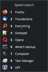
Press [/] (forward slash) to display the Speed Launch list and refresh your memory:
- Example Speed Launch list
Press the number (1-9) on the keyboard or click the shortcut with the mouse to launch.
Use the up/down arrow keys to select an item and hit Enter to launch.
Tag Start: Select this option to specify that launching the
selected shortcut will automatically start all other shortcuts
that share the same tag.
(More on shortcuts)
Shortcut Tags: Tags allow you to show specific shortcuts that
belong to a certain tag and hide all the rest. Each shortcut can
have multiple tags. Add tags to selected shortcuts by opening the Shortcut Properties
dialog and entering comma separated tags (keywords) in the Tags field,
or selecting an existing tag from the drop down list on the right-hand side of the Tags field.
Scroll through workspace tags using [Ctrl+Tab] or show shortcuts that share the same tag
within a single container (see above for the container Select
Tag button). Example of flipping through workspace-wide tags:
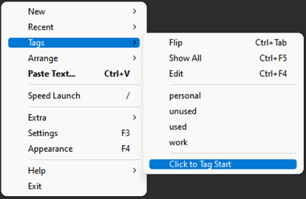
Show all shortcuts that share a specific tag and hide all the rest from the
main workspace right-click menu → Tags.
From the same menu select 'Click to Tag Start' to start all shortcuts that share the
same tag instead:
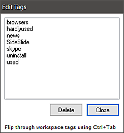
Delete shortcut tags using the workspace right-click menu → Tags → Edit:
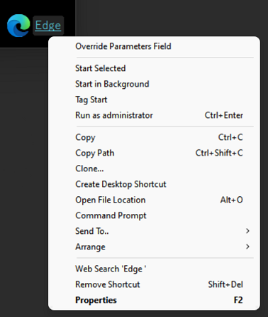
Right-click a shortcut to show the menu:
A shortcut right-click menu example for a shortcut with parameters
Override Parameters Field: Temporarily ignore any parameters assigned to the shortcut in the
Shortcut Properties dialog. This option will only appear under shortcuts with assigned
parameters.
Start Selected: Start the selected shortcut(s). This will override Tag Start if it was
selected
for the shortcut from the Shortcut Properties dialog.
Start in Background: Start the selected shortcut(s) while leaving the workspace active and
in focus (the workspace will not collapse). Tip: Use Middle-Click to quickly launch shortcuts in background.
Tag Start: Start the shortcut and all other shortcuts that share the same tag. Use this to open multiple folders at once,
all of your web browsers when testing a site, etc. In the Shortcut Properties dialog
select the Tag Start option to specify that launching the selected shortcut (with keyboard or mouse) will always cause other shortcuts that share the same tag to start as well.
Clone: Once selected, a cross-hair cursor will appear, allowing you to select the location for the cloned shortcut. Once you choose the location, the Shortcut Properties
dialog will be displayed, allowing you to adjust the properties of the cloned shortcut before it is created in the destination:
Send To: Send the selected shortcut(s) to one of the programs selected for Speed Launch.
Spacing:
Spacing... under the Arrange menu
Select this option to manually set the spacing, in pixels, shortcuts in the workspace when arranging them in columns.
Change this setting individually for each container from the Container Properties dialog [F2]. Manually increase or decrease the spacing
between shortcuts by clicking the corresponding button in the Shortcut Mini-Toolbar:
Hold down the [Ctrl] key to drag the selected shortcuts
after setting the spacing in order to keep the custom selected spacing. Otherwise, the shortcuts will be arranged using the default spacing.
Using shortcuts as labels:
Another neat idea is to use shortcuts as labels to further organize other shortcuts (or any object for that matter) in the workspace or
inside different containers. For example, use this technique to organize a project you are currently working on:
Add a shortcut to any random file and change its icon to any generic icon that indicates it's a label and not an actual shortcut.
It's possible to change the font size and color as shown in the image above.
SideSlide is fully keyboard accessible allowing you to keep your
hands on the keyboard and still quickly open any shortcut, website,
folder or news feed.
Click an empty place in the workspace or inside a container and
press [Ctrl+A] to select all shortcuts.
Press [Esc] to deselect.
Shift+F10 (Menu key) to show workspace/container right-click menu or the shortcut menu, when there are shortcuts selected.
Use the arrow keys to select a shortcut, then [Enter] to start, [Ctrl+Enter] to run as administrator
and [Del] to delete.
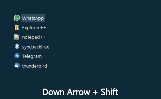
Use the [Shift] key + Up/Down/Left/Right to select shortcuts (Esc to deselect) and [Ctrl] +
Up/Down/Left/Right to adjust their position:
Use the arrow keys to select and move shortcuts (Shift/Ctrl)
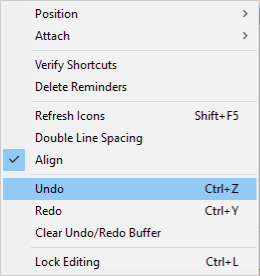
Use [Ctrl+Z] and [Ctrl+Y] to Undo/Redo containers and shortcuts position.
Undo/Redo under the Arrange menu
Use the [Spacebar] key (forward) or [Shift+Spacebar] (backward) to
flip through containers in the workspace (focus, unfold and expand).
Select if you want to flip through all containers, RSS
news feeds, notes and reminders or individually selected
containers. See under [Settings → Keyboard Navigation → Spacebar Flip]. Designate
individual containers to be included in the Spacebar Flip function by right-clicking the container title
→ Arrange → Spacebar Flip. This option can be switched on or off for multiple selected containers (select container with
Ctrl+Left click).
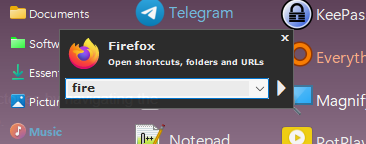
The Keyboard Launcher allows you to start any shortcut in the
workspace with any custom parameters, open websites, easily open
directories by navigating the directory tree, start all shortcuts that share a specific tag, create
notes, calculate an expression, set quick reminders and search the web.
To activate the Keyboard Launcher, simply press on any key when the workspace is in focus:
To show the Keyboard Launcher: Invoke the workspace using the Global Hotkey and start typing,
focus on the workspace using the mouse and start typing, or use the right-click menu → Extra → Keyboard Launcher.
Enter any part of the shortcut you want to start and
press [Enter]. [Ctrl+Enter] to start the selected shortcut as administrator
(This will override anything else entered in the Keyboard Launcher).
Use the Down Arrow key to go to the next matching shortcut or [F4] to open the dropdown list,
showing all other shortcuts that contain letters typed into the Keyboard Launcher.
Launch shortcuts with custom parameters:
Enter the shortcut name, press the [Right] arrow key or [Tab] (to complete the name and
add a space) and jump to the end of the name, then enter any
additional parameters required by the program (this overrides any
parameters specified in the Shortcut Properties dialog).
Example: Add a new shortcut to c:\windows\system32\cmd.exe, type
in "cmd" + [Tab] + "/c dir /s"
Open the default web browser and load a website by entering a
web address (e.g. google.com).
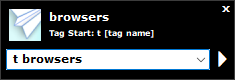
Start all shortcuts that share the same tag by entering "t " followed by the tag's name:
* Since every shortcut can have multiple tags, it's possible to set a certain tag as the shortcut's
name alias so that it can be launched with the keyboard using a different name.
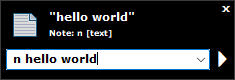
Create a quick note by entering "n " followed by text:
Tip: Notes can be automatically detached from the
workspace upon creation by selecting [Settings → Containers → Detach Notes].
Invoke the workspace using the Global Hotkey,
press [Ctrl+N] (or type "n " + text) to create a new note. When the note container is
detached, tuck it away in the corner of the screen using [Alt+Left], [Alt+Right], [Alt+Up] or [Alt+Down]:
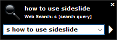
Start a web search by entering "s " followed by text:
Change the default search URL under [Settings → Keyboard Navigation → Web Search].
Select [Settings → Keyboard Navigation → Start Web Search on Spacebar] to
cause any input in the Keyboard Launcher that includes a space character to start a web
search, as
opposed to entering 's ' + search query. Omitting the space will look for workspace
shortcuts instead.
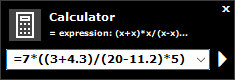
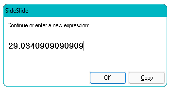
Calculator: Enter = (the equal sign) followed by an expression. Other operations that can be used: ^, *, /,
+, - and ()
Press [Enter] to see the result, continue the calculation or start a new one. There is also an option
to copy the result to the clipboard:
Deselect the [Settings → Keyboard Navigation → Speed Launch / Calculator] to
immediately
start the calculator when entering a number.
Use [Ctrl+Number] for Speed Launch.
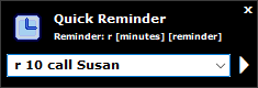
Create a Quick Reminder by entering "r " followed by 0-99 (minutes) and a reminder:
Enter an RSS news feed name to expand, unfold or focus on an RSS
container. Refresh the news feed using [F5] and scroll through the
headlines with the arrow keys.
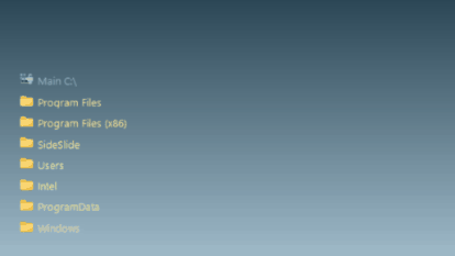
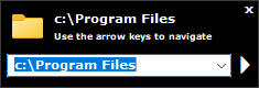
Directory Navigator: Enter the initial folder, or simply [\]
(backslash) then the [Down] arrow key to quickly access all
subfolders, the [Right] arrow key to go to the next level in the
directory tree and the [Left] arrow key to go one level back.
Press [Enter] to open the folder:
\ (backslash): Open the Keyboard Launcher and begin navigating from SideSlide's root drive.
~ (tilde): Quickly access your user profile folder.
Esc, Esc, Esc, Esc: Press the [Esc] key once to clear the search
box and deselect shortcuts. Press it twice to hide the Keyboard Navigator. Press it three
times to deselect any selected containers (if there
are any) and four times to tuck away the workspace.
Use the Esc key to shrink a container that was just expanded and fold a container
that was unfolded by double-clicking its name label.
Press [Alt]+[O] to open the target path of the currently selected shortcut (this will only work with
shortcuts, not with system commands or URLs).
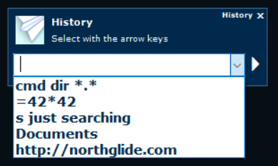
Keyboard Launcher History: Show previously entered commands:
Enter ! (exclamation point: Shift + 1) or Alt+H when the workspace is in focus, click the History command from within the
Keyboard Launcher dialog or via the menu: Extra → Keyboard Launcher History.
This setting can be configured from the Settings dialog under the Keyboard Navigation section.
SideSlide includes support for displaying RSS news feeds inside
special containers. Track multiple feeds in one convenient
location. Either have all RSS containers accessible from the
workspace, shrunk, folded or fully visibly, or detached from the
workspace to gain additional control. In addition to a built in
viewer, SideSlide allows you to track subjects that interest you by
highlighting headlines that contain predetermined keywords and filtering news feeds for specific items.
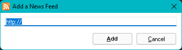
Add RSS news feeds by using the Add a News Feed dialog (Menu → New → RSS News Feed or
[Ctrl+E]):
Web URLs copied to the clipboard before opening this dialog will
be shown in the text field.
The new news feed will appear inside a container:
Expand and unfold (or just focus) on RSS news feed containers by
entering the news feed name (Reminder: Rename containers, including RSS containers, using [F2] when the container is in focus.)
Use the Spacebar Flip option to scroll through the workspace's RSS containers and read the latest news.
Shrink expanded RSS containers using the [Esc] key, by right-clicking or double-clicking an empty place inside,
as well as by double-clicking the "last update" label at the bottom left of the container.
Fold an RSS container with right-click, after unfolding it by double-clicking the container title.
Refresh the feed by clicking the 'Refresh' button (right of the
shrink/expand button) in the container's toolbar, pressing [F5], using the middle mouse button, or by holding down [Shift]
and pressing the left mouse button on the container's title or icon (when shrunk).
Press the [Down] and [Up] arrow keys to select headlines,
[Enter] to open the built in RSS viewer or [Ctrl+Enter] to open on
site. Press the [Left] and [Right] arrow keys to scroll
horizontally.
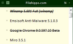
After opening news items, the headline will be marked as read:
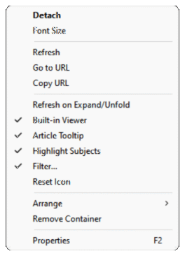
Right-click the container title or the icon of shrunken RSS
container to show some specific RSS container menu items, such as
Refresh (to refresh all selected news feed containers) Copy URL,
Go to URL and Reset Icon in addition to the normal container menu
items:
The 'Refresh on Expand/Unfold' option saves you the trouble of clicking refresh, and
is pretty useful for weather RSS news feeds.
Select the 'Built-in Viewer' option to override the global
setting for individual RSS containers.
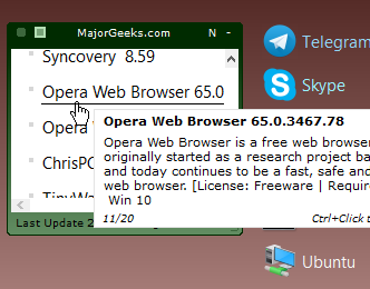
Select the 'Article Tooltip' to show the first few lines of
the news feed item in a tooltip when hovering the headline
with the mouse or when scrolling through headlines with the
arrow-keys.
Select 'Highlight Subjects' to highlight news items that contain keywords you previously
searched for or selected to track. See Subject Tracker for more.
Select 'Filter...' to filter out any headline that doesn't include one or more of the specified keywords. See below for more.
Some of the options in the menu are also accessible from the RSS container itself:
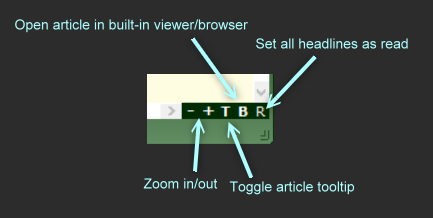
Set all items as read by clicking the [R] button at the bottom right of the container.
Quickly adjust headlines' size by clicking the [+] and [-] buttons next to the [R] button.
Right-click a headline to create a new note with the item's description.
Middle-click a headline to open it with the default browser in the background.
Use the mouse wheel + [Ctrl] (or the Pinch Zoom gesture) to resize headlines.
Use the mouse wheel + [Shift] to scroll horizontally.
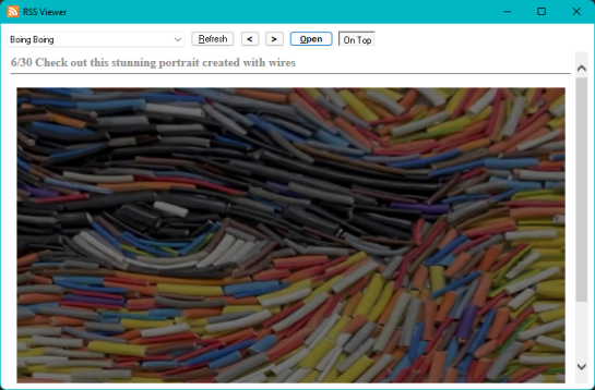
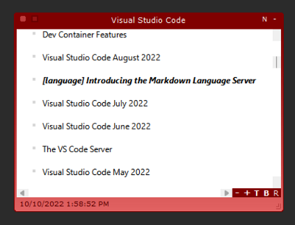
When you open a news item, or press [F12], the RSS Viewer dialog will be displayed:
Disable the RSS Viewer for each individual RSS container in order to load the
items directly on site. Even when the RSS viewer is enabled for a specific container,
right-click a headline, [Ctrl] and left-click or [Ctrl+Enter], in order to open the article on the website.
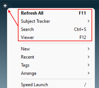
Search for news feed items by opening the Search RSS dialog using [Ctrl+S] or from the main menu in
SideSlide's title bar. The top 4 menu items are RSS related:
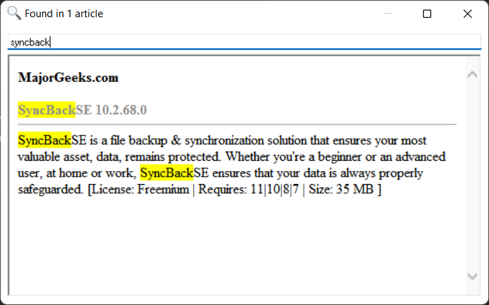
The RSS Search dialog lets you 'search as you type' within
populated news feeds' titles and descriptions:
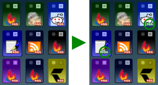
Highlight headlines of feeds that contain specific words by
adding subjects you are interested in to the Subject Tracker:
Subject Tracker → Add. When refreshing a feed and the tracked subject is found in one of the articles,
the article's headline will be highlighted:
Disable/enable headline highlighting individually for each RSS container (Right-click a
container and select Highlight Subjects).
Click a subject from the Subject Tracker menu to load up the RSS Search dialog and highlight it within the content of the article.
Show tracked subjects and remove: Subject Tracker → Edit.
When containers are shrunk and subjects are found in one of the articles within the news feed,
the RSS icon on top of the container icon will change from red to green:
Rather than highlighting specific headlines, it's also possible to filter out any headline that
doesn't contain one or more of the specified keywords. Select the 'Filter...' menu command from the RSS right-click menu and enter a comma separated
list of keywords. Headlines containing one or more of the keywords in the list will be shown while all the rest will remain hidden:
When a filter is applied, the RSS container title will be shown in italic font.
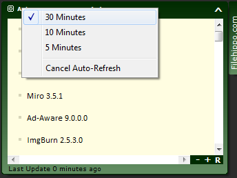
Detaching news feed containers
When RSS news feed containers are detached, set them to automatically refresh every 5, 10 or 30
minutes by clicking 'Auto':
The animation below shows an example of how detached RSS containers can be organized
(or any type of container for that matter) around the desktop:
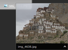
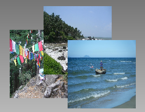
Add pictures to the workspace or to a container from the New
right-click menu, or by dragging a picture file from Windows
Explorer or an image from the web browser while holding down the
[Shift] key:
Resize a picture by dragging it from any corner.
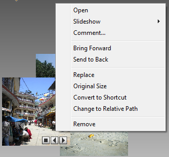
There are a few things that can be done with each picture, such as,
replacing it with another one keeping the same size, adding a comment
(visible when hovering with the mouse over the picture), converting it to a shortcut
to the picture file, changing to a relative path and
more. Right-click a picture to see the menu:
Every JPEG picture you add to the workspace can be turned into a
slideshow, displaying other pictures from the same folder. Start the
slideshow by clicking the [Play] button at the bottom right of the
picture, and stop is with the [Stop] button. By default, the
slideshow will advance every time the workspace is undocked, keeping
things interesting. This functionality can be disabled via [Settings → Dock →
Auto Slideshow].
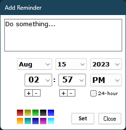
SideSlide allows you to add basic quick reminders to the workspace.
Add a reminder from the workspace right-click menu, using the
keyboard shortcut [Ctrl+R], or by dragging text (e.g. from the web
browser, Outlook emails, etc.) while holding down the [Shift] key.
Here's the Add Reminder dialog:
Enabling the 24-hour check-box will impact not just the format for selecting reminder times,
but also when displaying the time in the title bar (using the %TIME% macro).
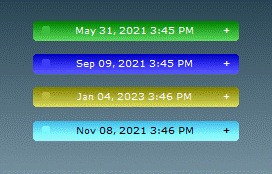
By default, reminders are added as folded containers showing the scheduled date and time.:
Choose a different name by Right-clicking the reminder's title-bar and select Rename.
Reminders are special containers, so it's possible to edit the text inside,
change colors and more. When hovering over the reminder icon (when
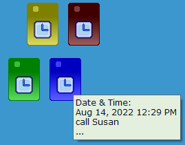
shrunk) or name (when folded), a tooltip will be displayed showing the time it is
scheduled to appear:
Turn reminders into notes and notes into reminders from the note or reminder right-click menu.
Start the reminder text with an exclamation point (!) so that when you clear the reminder by selecting [Complete] it will be turned into a note.
Right-click a reminder to change its colors, rename it, edit and more.
To change the Shrink Size of a reminder, select the reminder as well as another container
(Ctrl+Click to select) and use the other container to change to Shrink Size of both (Right-click → View → Shrink
Size).
Create a red/important reminder by including ** (two asterisks) in the reminder's text.
Select [Settings → General → Repeat Reminder] to keep the reminder alarm
sound going for 10 times.
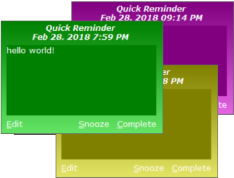
The reminder alert will pop up at the bottom right corner of the
screen. Mark it as complete, snooze for 5 more minutes or open the reminder for
editing. The color is based on the reminder color in the
workspace:
The alarm sound you hear is the alarm.wav file found in
SideSlide's root folder. Change it to any other WAV file,
or delete it. There are plenty of alarm sounds in "C:\Windows\media". Copy a wav file to
SideSlide's root folder, delete alarm.wav and rename the new file instead.
Download an alternative alarm sound here, or a more modern one here.
There are many more things you can do with SideSlide
and some that I haven't covered (like Folder Connectors and more).
Make sure to right-click everything and experiment! Until I come up
with a proper user manual, this tour should be more than enough to
get you started. There's also tons of information in the Change
Log, when new features were added.
Use SideSlide
from a USB drive/Portable Installation
Download the portable version Zip file from the
Download page and extract to the USB drive.
Any object (wallpaper, file, folder, picture, etc) you add from the same USB drive will be accessible
even when Windows assigns a different drive letter to the drive.
Quickly change the target path for shortcuts be using the "@" (at symbol) instead of the drive letter
when editing shortcuts from within the Shortcut Properties dialog.
Multiple Workspaces
To use more than one workspace, extract the portable version into different folders (e.g. SideSlide1, SideSlide2, ...) and
launch SideSlide.exe from each folder. It's possible to set a custom title for each workspace (See Title Bar under Settings → General)
and treat a workspace as if it was a single container. This aids in distinguishing it from other active workspaces, making it easily recognizable among the rest.
Show/Hide the Workspaces using a 3rd party software
When starting SideSlide.exe from the same location (e.g. the default installation folder), the workspace
will show if it's hidden or undock. You can use a 3rd party software such as Logitech SetPoint,
Microsoft Keyboard and Mouse
Center or the Surface Pen to set a button that shows and hides the workspace by pointing to
SideSlide.exe.
Download additional themes to completely change SideSlide's appearance:
Click the image below to download the theme's zip file.
Open SideSlide's settings folder by pressing [F3] when the workspace is in focus and [F3]
again when the Settings dialog is displayed.
Extract the zip file into the SideSlide\Skin folder. The .ngt file should be in the Skin
folder, Buttons and Wallpaper in Skin\Buttons and Skin\Wallpaper.
Simply Dark 2
Leaf
Simply Dark
Constellation
Peacock
Alien Planet
White on Blue
Purple Haze
Sky
Techno Blue
Techno Brown
Vista
Wave
Dark Order
Blue Order
Blue
Claws
Golden Sand
Gray
Green
Orange
Alien Planet 2
Diamond Tech
The Game
Post It
Some themes are using the same title-bar buttons and some use the preinstalled ones such as the default button set.
Rather than themes which include a wallpaper, you can also choose a color scheme by loading up the Appearance dialog [F4]
and selecting a color scheme from the Colors list:
Alternative default container icons:
Download SideSlideConIcons.zip, exit the program and overwrite the icons located in SideSlide root folder (reminder.ico, note.ico and emptyicon.ico) with the ones in the zip file.
Command line options:
/?: List command line options /loadrss: Load RSS newsfeeds on startup /nosplash: Suppress
splash screen /backup: Backup SideSlide settings into a zip file. The zip file,
"SideSlide_Backup.zip", is
created in SideSlide's settings folder.
/silent: Do not show the Backup Complete notification.
Using non-English characters for shortcuts, container names and other workspace elements (v5.45b and above)
Setting a Language for Non-Unicode Applications:
Open the Control Panel.
Select "Clock and Region".
Select "Region".
Click the "Administrative" tab.
Under "Language for non-Unicode programs" click "Change system locale".
Choose your language under "Current system locale" or select "Beta: Use Unicode UTF-8 for worldwide language support".
Windows Vista/7/8/10/11: Starting an app that requires admin
privileges without the UAC prompt
Select the Administrator check-box for shortcuts that
require admin privileges, but it's also possible to run shortcuts with the
highest privileges without the UAC prompt:
Click the Windows Start button.
Enter Task and launch the Task Scheduler application.
From the menu select Action and Create Task...
Give the task an easy to remember name (preferably the name of
the program you want to run with admin privileges, e.g. CCleaner).
Check the Run with highest privileges check-box.
Switch to the Action tab, click New... and then click Browse...
to select the program.
Click OK twice.
From SideSlide:
Add the program shortcut to the workspace, right-click the new
shortcut and select Properties.
Optional: Select and copy the path from the Target field and
paste it in the Icon field.
Check the Command check-box.
Enter schtasks /run /tn "THE NAME YOU CHOSE FOR THE TASK" in the
command field.
Shortcut to My Computer
Create a shortcut to C:\Windows\explorer.exe and enter a simple comma (",") in the Parameters field.
Shortcut to delete folders and files:
The following batch script will completely delete entire folders or files without warning, skipping the recycle bin:
@echo off
if exist %1\ (
	rmdir /s %1
) else (
	if exist %1 (
		del %1
	)
)
Warning! Only use if you know what you're doing: Save this file as "Delete.bat"
anywhere on your hard disk and it to the workspace (rename and set other options from the Shortcut Properties dialog).
Now you can drag files or folders straight to this shortcut in order to completely delete them.
Taking back Win+S shortcut key:
Since Windows 10 Anniversary Update, the key combination Win+S opens Search/Cortana.
If you would like to use it in SideSlide again, follow the steps below:
Open the Registry Editor and naviage to:
HKEY_CURRENT_USER\Software\Microsoft\Windows\CurrentVersion\Explorer\Advanced\
Create/edit DisabledHotkeys as Expandable String Value.
Double-click it and type s
Log out and log back in.
You will now be able to use Win+S as SideSlide's Global Hotkey.
You should always back up the registry before making changes!
Shortcut to 'Show my Desktop' (hide/minimize all windows and show the desktop):
Create a new System Command shortcut (Ctrl+O), then copy and paste the following in the Command
field:
2. Enter 'apps' in the Search field and press the Enter key or click the 'Go' button.
3. Select a container and click 'Add'.
Shortcut to Task Manager:
Search for "Task Manager" in the Container Library [F6]
and add the container. Move the shortcut to any location in the workspace and also set it for
Speed Launch.
Windows 11: Shortcut to the Windows Terminal and executing commands from the Keyboard Launcher:
Add a new System Command shortcut and paste the following into the Command field: explorer.exe shell:AppsFolder\Microsoft.WindowsTerminal_8wekyb3d8bbwe!App
Enter Term in the Name field. To execute commands from the Keyboard Launcher, enter Term, press the [Space] or the [Tab] key followed by the command you wish to execute.
Shortcut to Microsoft Edge Browser:
Create a new Web URL shortcut (Ctrl+W) and paste the following
into the URL field:
microsoft-edge://
Shortcut to Windows Update:
Create a new System Command shortcut (Ctrl+O), then copy and paste the following in the Command field:
start ms-settings:windowsupdate
Select "Minimized" from the "Run" drop-down list.
Other Windows apps:
Create a new Web URL shortcut (Ctrl+W), then copy and paste one of the following in the URL field:
bingweather://
bingmaps://
ms-clock://
ms-photos://
microsoft.windows.camera://
onenote-cmd://
mailto://
ms-windows-store://
mswindowsmusic://
mswindowsvideo://
ms-settings://
calculator://
ms-todo://
Close Windows Metro Apps with a mouse click (Windows 8):
ClickToClose is a tiny utility I wrote that allows you to click the
upper right corner of a Windows 8 Metro app (where the Close button
should be) in order to close it and switch back to the Desktop.
Download ClickToClose.zip,
extract to any folder (there are 3 files in the archive, a DLL
file, an executable and a batch file to close the program) then run ClickToClose.exe (you can
also place a shortcut to ClickToClose.exe in the Start Menu Startup
folder).
The DLL and Executable must be in the same folder.
There is no Exit button or Close button, you must end the
ClickToClose.exe task from the Task Manager. You can also run the 'Close ClickToClose.bat' file.
I'm not sure if it will work for you, but give it a try.
There is also the added benefit of double-clicking the upper right
corner of the desktop to bring up the Shutdown Dialog.
Even when you can close the app in Windows 8.1 by clicking the [x] close button, the app still
stays in memory. With ClicktoClose, the app is closed with Alt+F4 so it's completely gone.
If you find SideSlide useful and would
like to show your appreciation, please consider a small donation
by clicking the Donate button above. Your donation is a huge help to keeping SideSlide alive and kicking!
If you do not want to use a PayPal account, notice on the PayPal page there is a link to continue without a PayPal account.


 Use SideSlide
from a USB drive/Portable Installation
Use SideSlide
from a USB drive/Portable Installation Multiple Workspaces
 Using non-English characters for shortcuts, container names and other workspace elements (v5.45b and above)
 Taking back Win+S shortcut key:
 Shortcut to Microsoft Edge Browser: